Designing Arktos
Science finds truth in the natural, physical world. Art finds truth in the emotional, metaphysical world. They entwine with Arktos, a bioscience startup that’s truly changing the world with their understanding and technology around protein production in DNA and RNA. Watch this space!
Arktos is Greek for “bear.” Arktos’ founder James has a thing for bears. He went to UC Berkeley for his undergrad. Probably at least one more bear tie-back we’re forgetting right now.
Anyway, something bear-related was the easy option (their previous logo was a bear). Who doesn’t love bears? We drew some bears. They were very cool.
But we came full circle to the idea that DNA is sovereign. Arktos doesn’t exist without it. The mark and extended identity should reflect the power of the double helix.
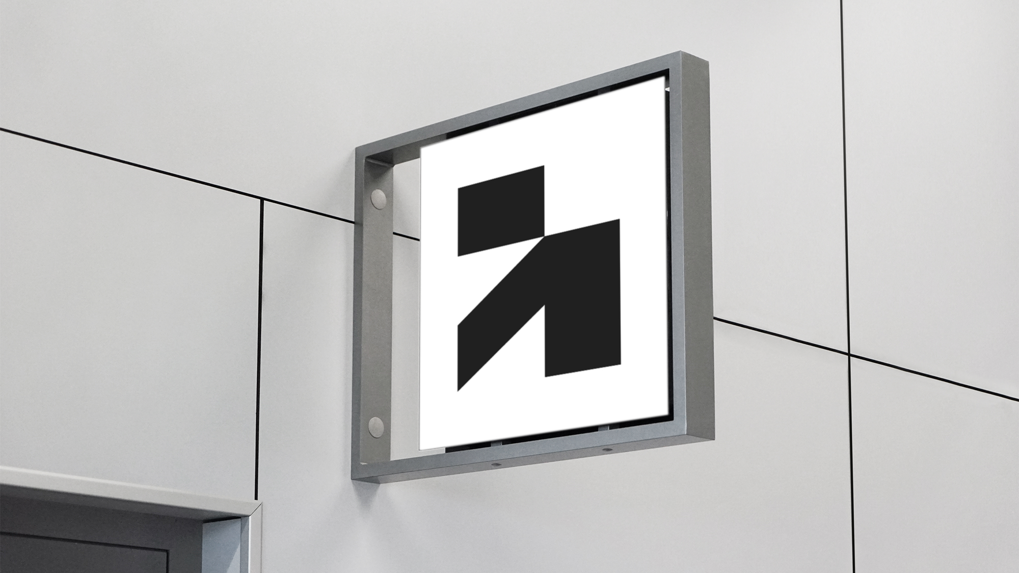
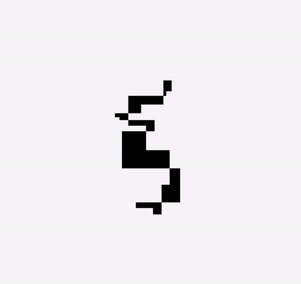
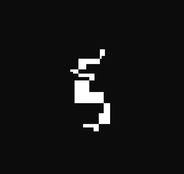
The brand mark is more than just a lowercase “a” monogram. The x- and y-axis on emphasize the diagonal line: a metaphor for the heat maps of DNA. The unique mark also opened a Pandora’s box of possibilities with shape layout...
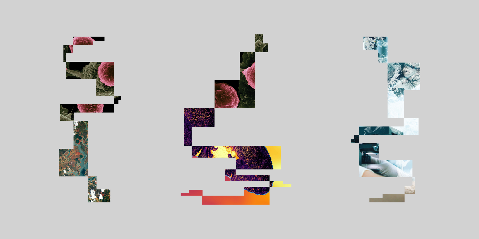
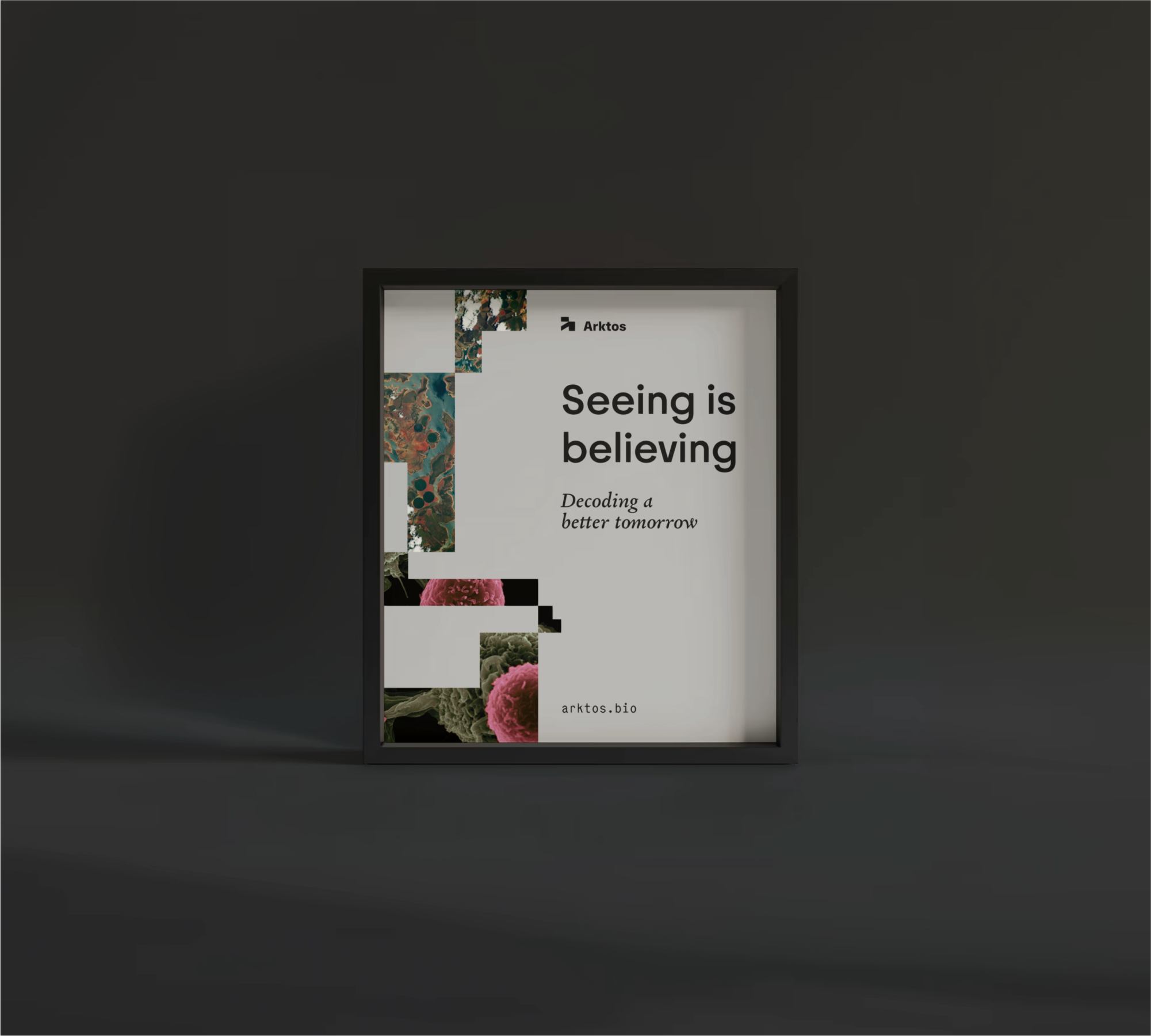
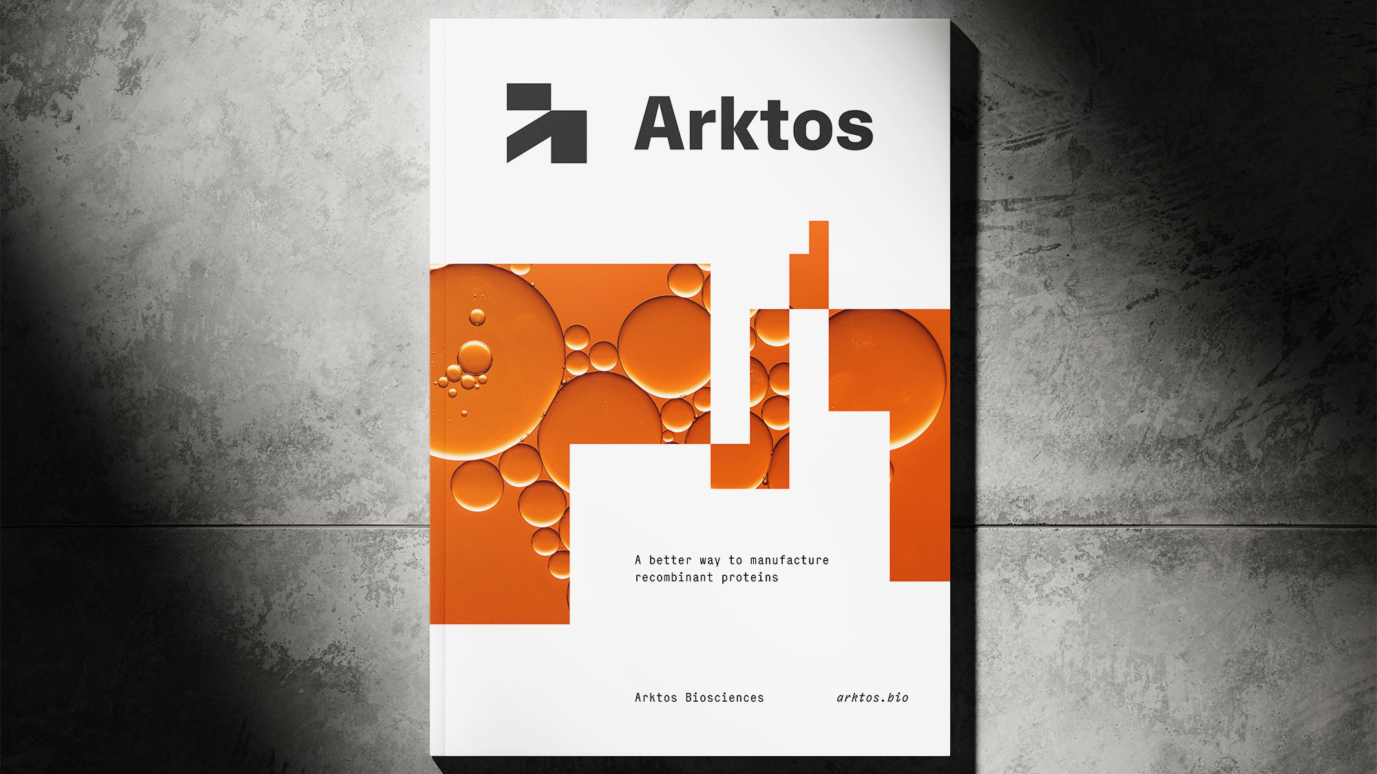
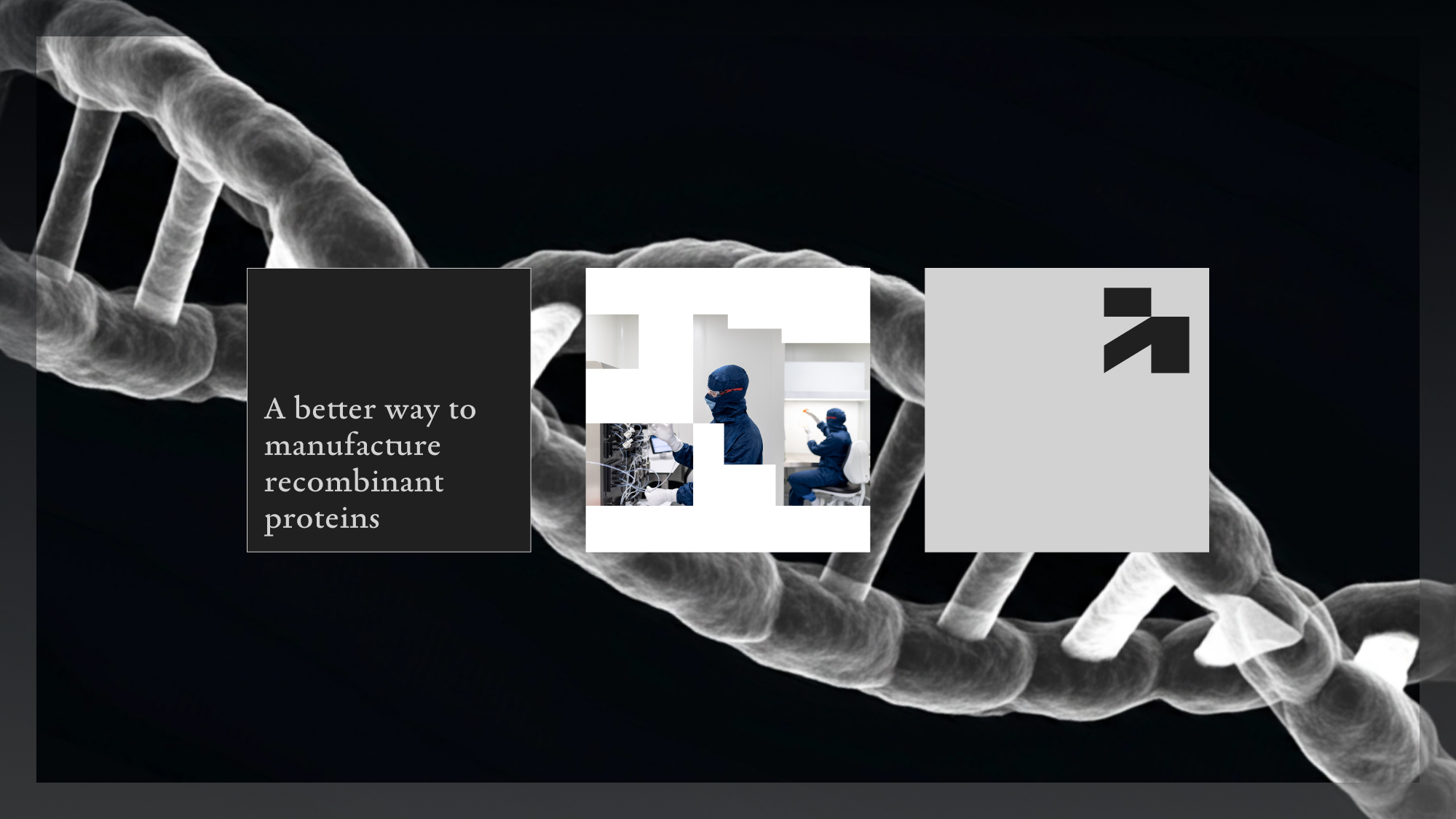
We wanted to reconsider how we visually show strands of DNA. We created a dynamic and kinetic system based on the core DNA visual motif, ever spinning and stretching — all from different angles.
We then used still frames from these moments to clip and mask macro and micro imagery.
Aerial photography and microscopic imagery is paired together to continue the narrative of Arktos’ core mission: global impact at a microscopic scale.
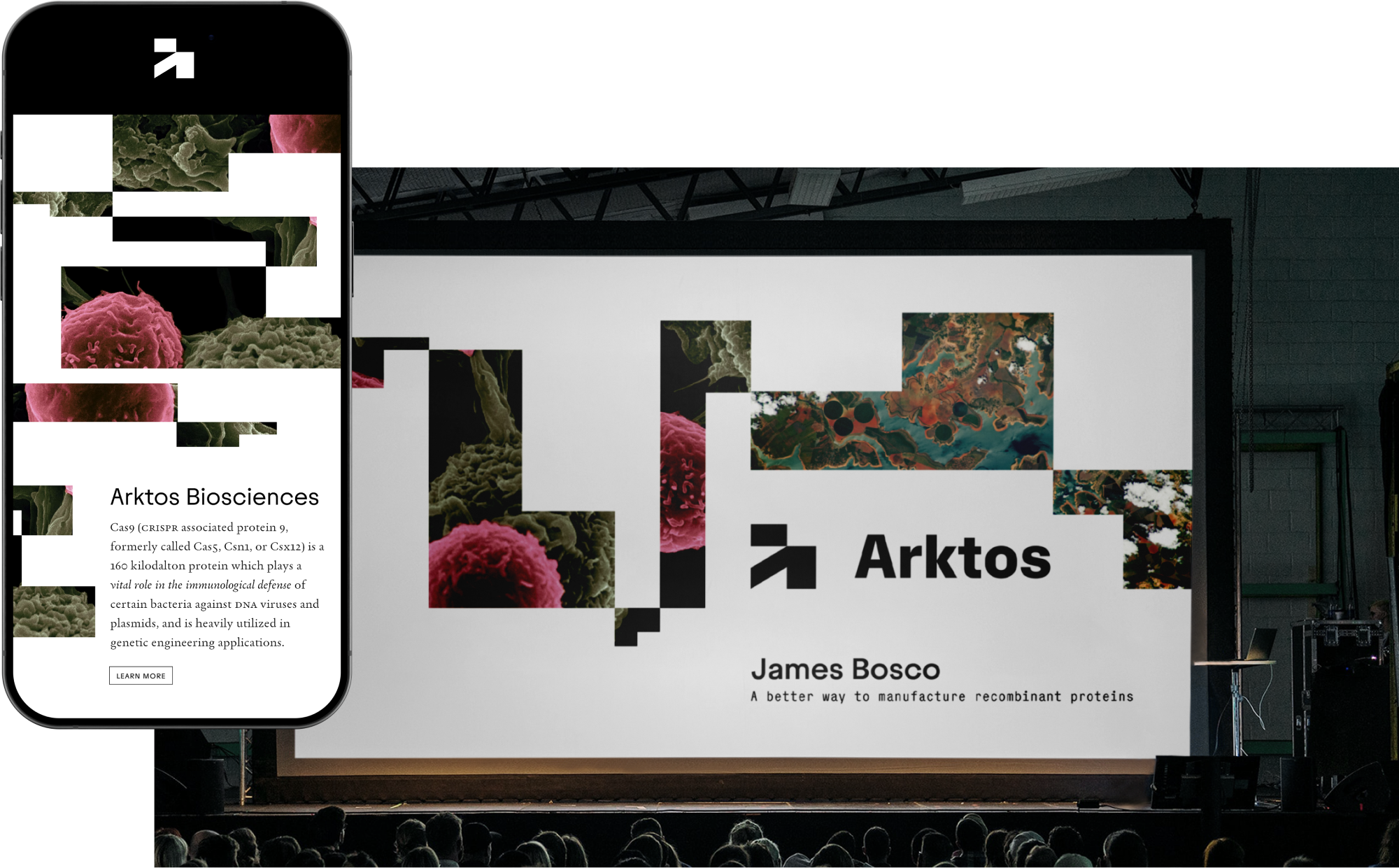
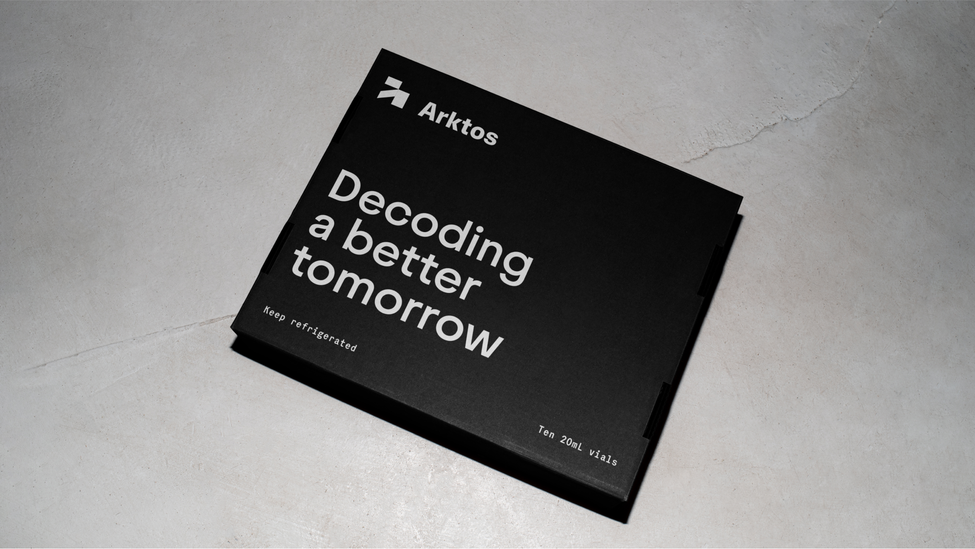
But of course, the typography is what really sings in the Arktos system. We employ three unique font families. Juneau is the sans serif headline. The geometry and simplicity are clear and excellent. Body copy is to be set in Garalda, a reinvented Garamond. And finally, Elma Mono is for supporting text and bylines — common in the world of science and attribution layout.
These three disparate families come together to create a true typographic texture and identity for Arktos to embody their vision of change.
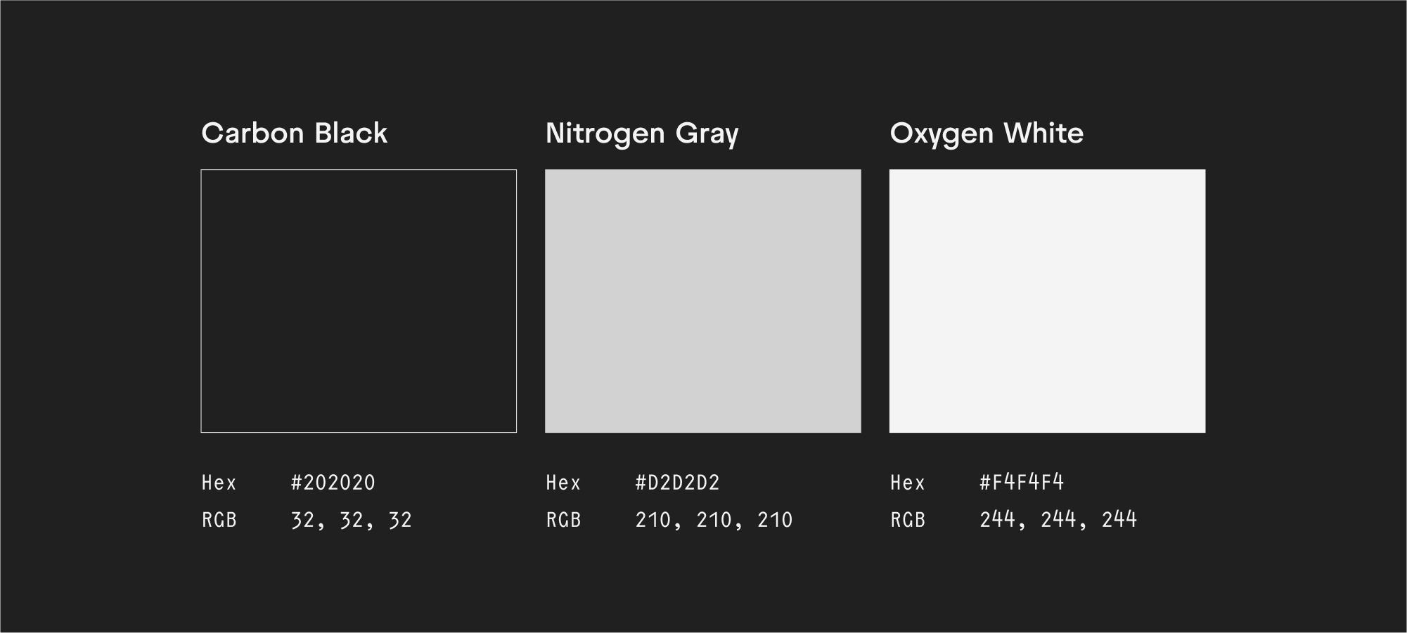
Since we turned typography up to the max, we turned down the volume of color. Grayscale is simple and manageable. Even with the spectrum of grayscale we are prominent with only three shades: Carbon Black, Nitrogen Gray, and Oxygen White. Contrast and accessibility is control with such a simple core brand palette, giving the imagery and metaphor room to breathe.
It has been a joy working with the wildly intelligent, generous, and capable folks at Arktos and we are pleased to continue our partnership in building out their physical space and engaging their digital presence. Expect evolution!