Designing Daylight
Daylight is a big idea — they make it simple to transform any home into a clean energy powerhouse. They offer solar, storage, water heater, HVAC, and efficiency products to turn your house into a decentralized power plant, and earn rewards through the new energy economy.
They also allow customers to monitor, optimize, and control their energy consumption in real time. The Daylight app connects all smart devices in a home, making energy management intuitive and effortless.
When Daylight approached us, they wanted to update their identity and web presence ahead of a Series A fundraising announcement. They were working with a simple, stark, technical visual identity rooted in cold colors (a real International Klein Blue) across their website and in their broader expression. It looked cool. They liked it. They had hats and everything.
So we tried a few explorations with the blue and existing sun-ish brand symbol...
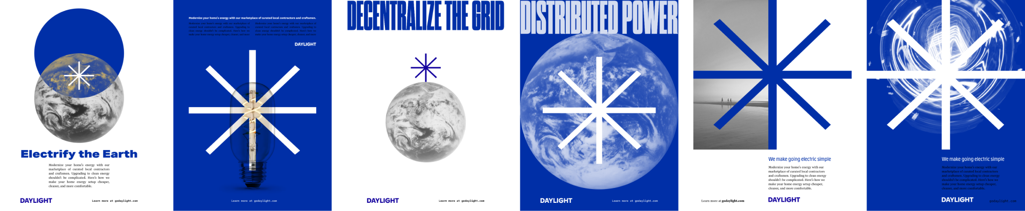
...but we felt it was too abstractly removed from the concept of Daylight as a sun-inspired brand. That kind of arm’s-length coldness ran counter to the brand values we identified in the discovery phase — specifically, a desire for Daylight to be more human and less technical (even though what their apps do is highly technical).

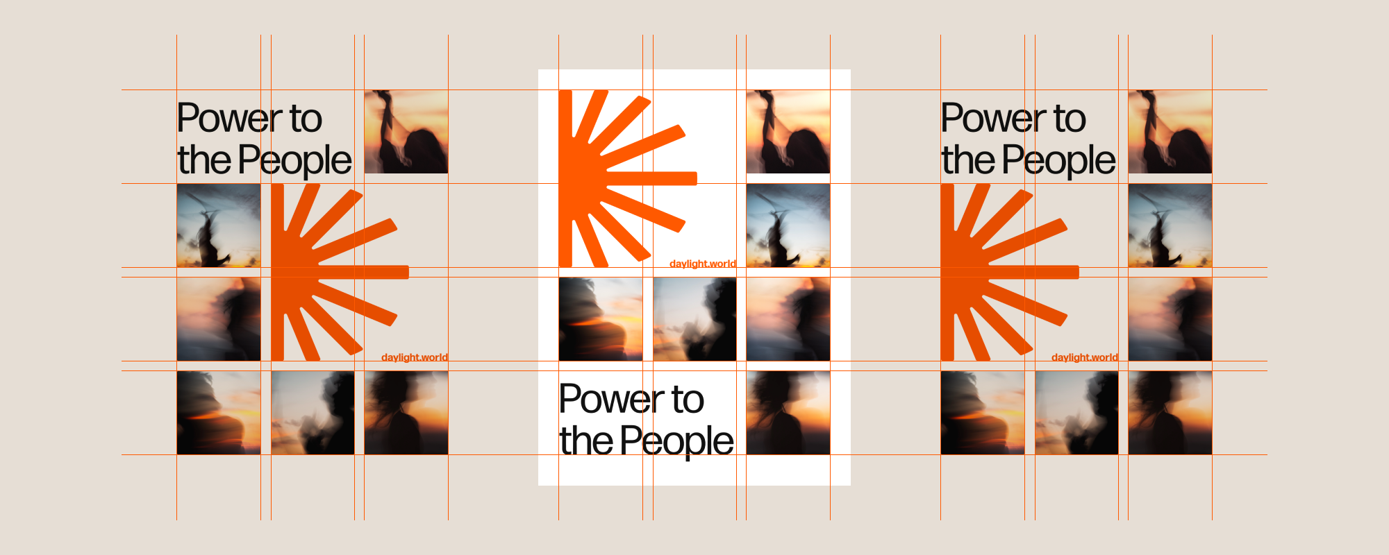
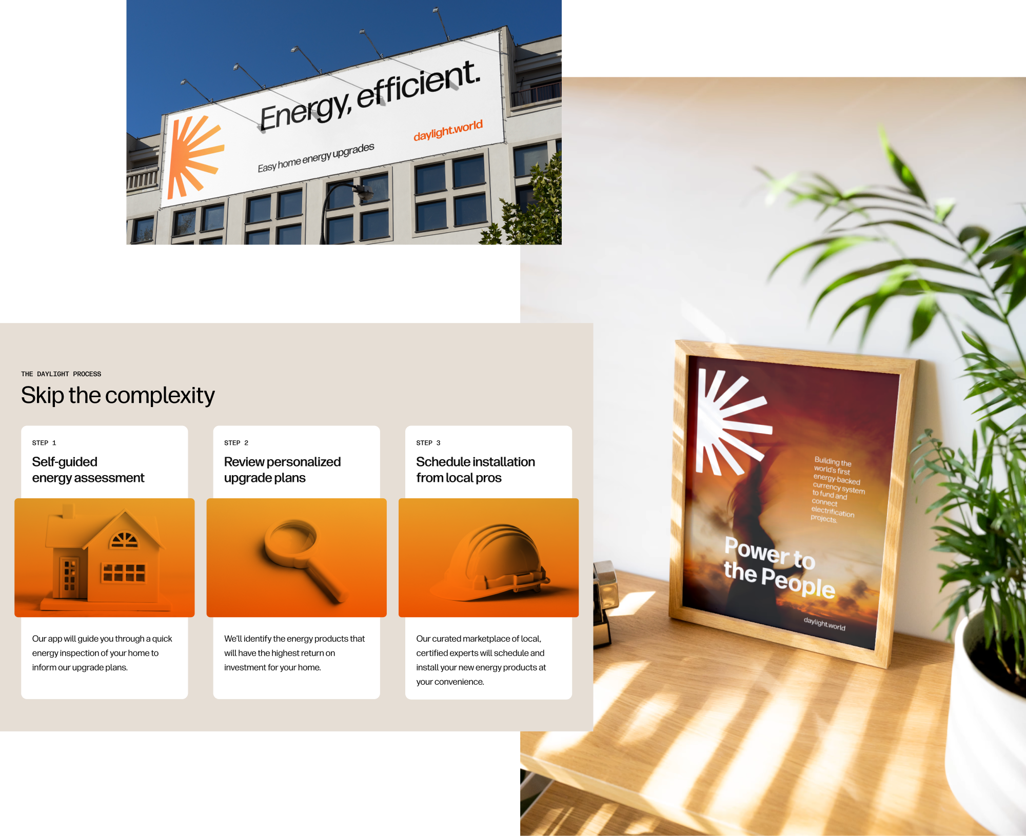
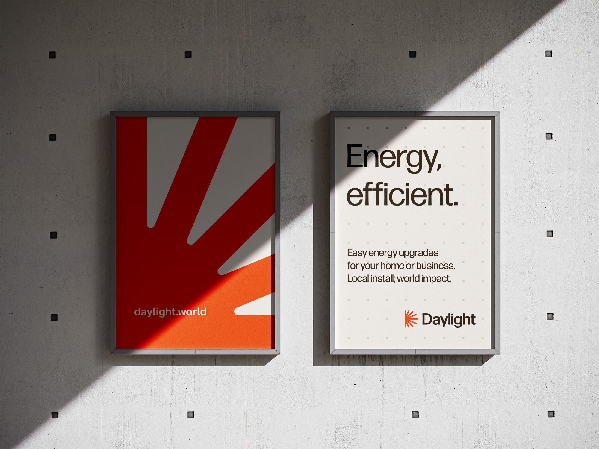
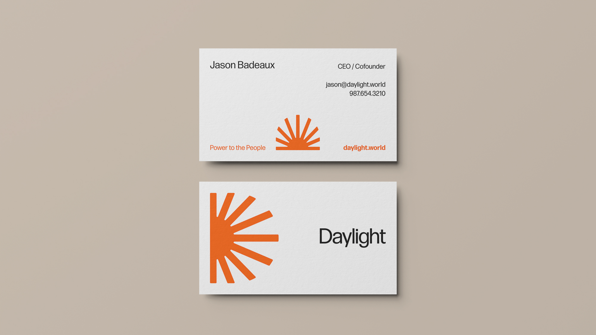
Everything started with a new symbol — which we nicknamed “Sol.” It’s a clear capital D monogram, but it’s also an iconic representation of the source of energy at the heart of Daylight. The mark can easily stand alone as a monument, but rotates into multiple configurations that showcase a true “sunrise” effect in larger contexts. From sunrise to sunset, the symbol scales to every application (and looks good on new hats, too!).

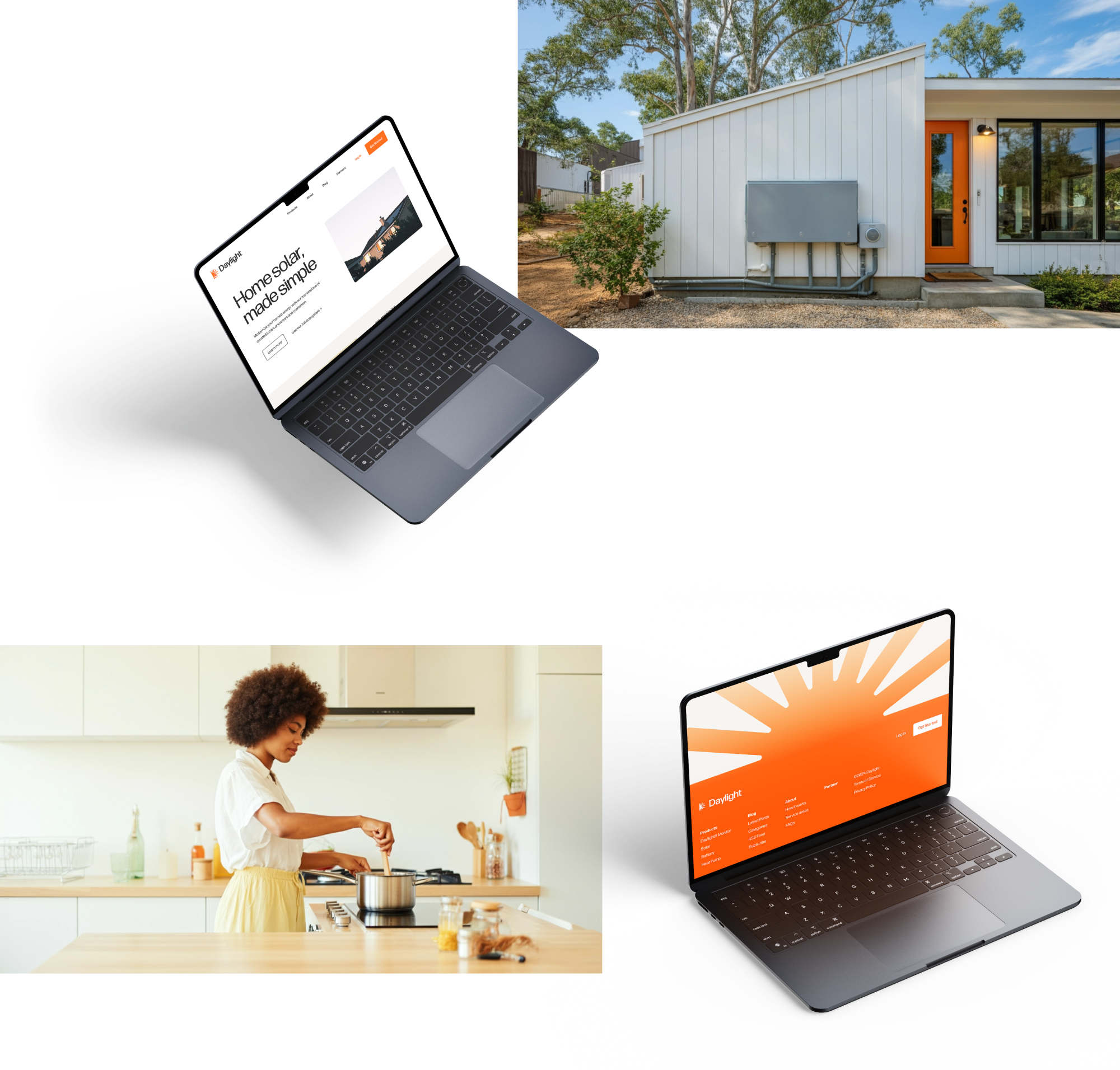
Then we introduced a new color palette to breathe life into Daylight, with saturated and vibrant orange hues and gradient options. The poetry was not lost on us — the first Warm project was going to be, well, warm. But if the palette fits! And boy, did it. There was energy in unlocking these colors, and it spilled over into the rest of the work.

Typography matters, especially for brands whose primary expression is a lot of copy across multiple websites and an app. Daylight needed the right mix of innovative and ambitious without overshadowing the human elements of the brand.
Daylight’s brand font family is exclusively Forma, slightly rounded and approachable type family designed by David Jonathan Ross. Forma was inspired by mid-century designs akin to Helvetica and Akzidenz Grotesk, but designed with subtle curves across terminals and through strokes. It had just enough character (pun very much intended) and variety in forms and weights.
We then carried those subtle typographic curves throughout the brand — in macro applications like UI form fields and buttons, and micro applications like coming back to the brand symbol and rounding the edges to match, all in service of humanizing the identity wherever people interact with Daylight.


We don’t believe brands are ever really “done” — especially identity work for early-stage companies in fast-moving industries. Daylight’s mission to build the world’s largest decentralized, sustainable power plant is going to take them places even they can’t imagine yet.
This foundational brand identity system prepared Daylight for a successful Series A fundraising announcement and website launch. The system is extensible and flexible enough to grow alongside Daylight as they continue to expand. But it will change and evolve, just like the company will.